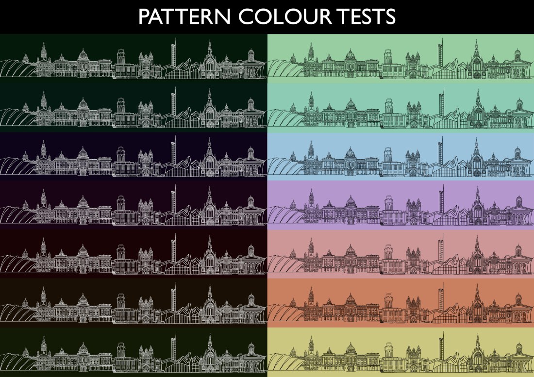
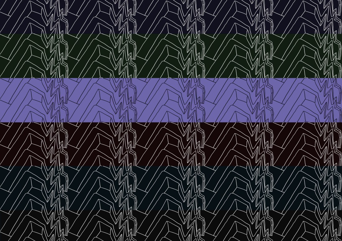
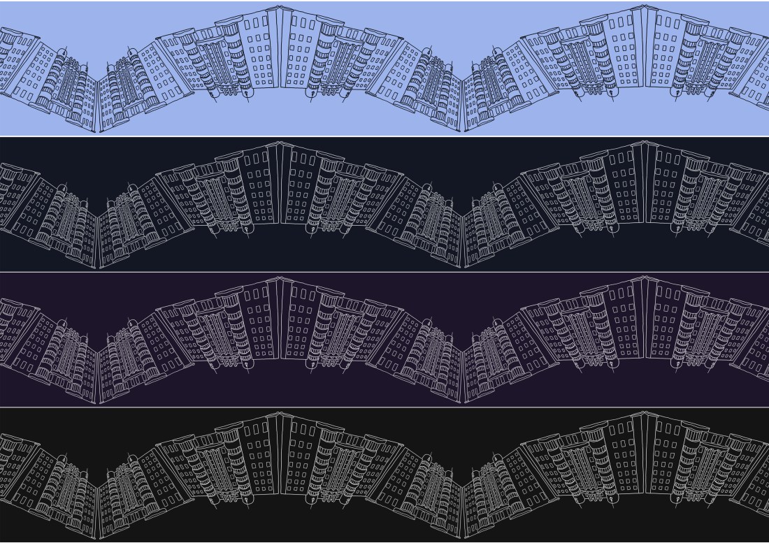
Next up I did a variety of different colour tests for my different designs, before I decide for certain which one I’ll get printed to make into the waistcoat. I tried a wide selection of colours, both light and dark, as well as making the linework white instead of black for the darker shades. In my opinion, the darker colours suit and waistcoat better, as the light and bright ones just make the design look more clown-like.
In terms of the best colours, I’d say that the dark greens, blues and purples are a better fit than the warmer reds and yellows, which just end up looking muddy and dull when darkened. I believe that the new ‘skyline’ design still looks the overall best, but I think the other two designs are still decent backups in the off chance that it doesn’t work quite as well in practice!
